Upcoming Website Design Trends For 2018
Quick question, when you're in need of information where do you go to find it? I can guarantee that the vast majority of people will perform a quick Google search. Right, so what's the first thing you notice about a website? The design and overall functionality. Poorly designed websites won't make the cut and your customers will jump ship and side with your competitors.
Redesigning and implementing new features on your website will improve your conversion rate and annual sales. This article will cover 7 upcoming website design trends for 2018!
1) Full Width Designs (Using Images & Videos)
Full width images / videos / animation sequences are growing in popularity, especially for ecommerce businesses. The reason why is simple - visual information is more appealing to look at, plus the 'human brain can process visual information 60,000 faster than words' - source Social Media Today. Visual information is also easier to remember which in turn improves online conversion rates (e.g. customers filling out contact forms or requesting content like an eBook) as well as online purchases. In fact, Forbes states visual information like a 'video on landing pages can increase conversion rates by 80%.'
We live in a society where everyone is on the go 24/7. People don't have the time to sit there reading what your company specialises in. Instead people want to be able to take one look at your site (without reading a single word) and automatically know if your business can fulfil their needs.
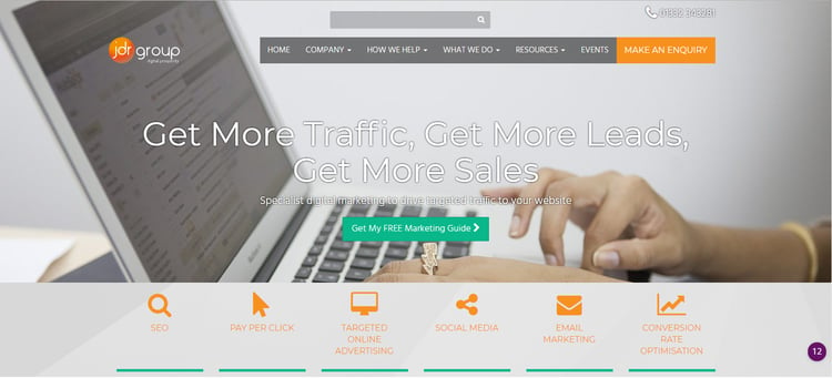
Check out the JDR website for an example of full width website designs.
2) Grid Format
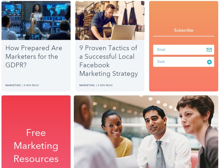
Back in the day websites used to follow a very linear format with lots of lists, whereas now websites are evolving to have more asymmetric appearances - a primary example of this is the blog feed on HubSpot's website.
There must be a distinct balance between the elements on the page otherwise the design will be overpowering and cluttered. Equal spacing, different alignments and text boxes are a great way to balance the visuals to help draw your eye across the site.
3) Bold Colour Choices
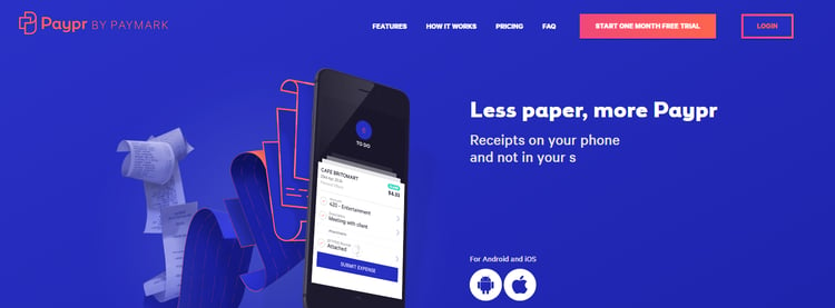
Implementing a new colour scheme can be very challenging - however, if possible, we strongly suggest using bright colours to ensure your site really packs a punch. As stated before, memorable designs with visuals and colour will improve customer recall. Basic colours like grey and white have a very polished, clean look - however a large percentage of websites use this pallet, and as a result your website just blends into the crowd.
Image source: https://www.paypr.co.nz/
4) Voice Search
The future of web design isn’t just visual - some of it will be audible.
Websites are evolving to understand and "hear" voice commands. With some websites the user can say "Contact Us" and the homepage will scroll or change to the contact details section.
Voice search drastically increases the usability rating of a website (especially as it helps online visitors with sight and hearing disabilities), for this reason, Google will likely promote websites with voice search - therefore boosting your Google ranking and your organic traffic.
5) Rounded Shapes
Sharp, angular shapes were the rave in 2016 and 2017 - but make way for fluid shapes like circles and rounded edges. Curves create a softer appearance to the entire design and encourages the user to read all the sections.
6) Fluid Web Design
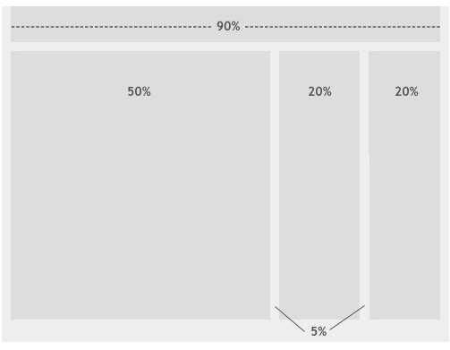
Fluid web design is a relatively new approach that uses percentage based widths rather than pixels, as shown in the diagram below. Fluid web design adapts to different screens and devices, enabling the site to stretch up and down to fit the page when resizing the browser window.
Check out this article for a full explanation: What Is Fluid Web Design?
Image source: Smashing Magazine
7) White Space
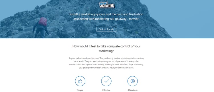
To put it simply, "white space" is a term used to describe minimalist designs that use equal padding and spacing so the design doesn't look crowded or "thrown together" in an unorganised manner.
Duct Tape Marketing is an excellent example of this.
Final Thoughts
Evaluating the appearance and functionality of your website is absolutely paramount to your business' success. It's no longer enough to say "we have over x years' experience in our industry" because most customers won't care about technicalities when they are just browsing; they will pay attention to the fine details of your website when they are genuinely interested in buying. A modern website will work wonders for your online presence and your conversions.
Contact the JDR Group today to book a FREE, no-obligation meeting with our online marketing specialist Andy Gibbins. Andy will take a look at your current online marketing strategy, including your website, and help you pinpoint areas for improvement.


