How To Check Your Website Usability With Google's New Tool!

Are you still worrying about the usability of your website? Do you even know how user-friendly your website is? Google has put a lot more emphasis on this over the last few years and has factored in different elements into their algorithm.
This includes things like page speed and mobile friendliness. Google has recently released a brand new tool that makes it easier for business owners to check the key user-friendly elements all in one place.
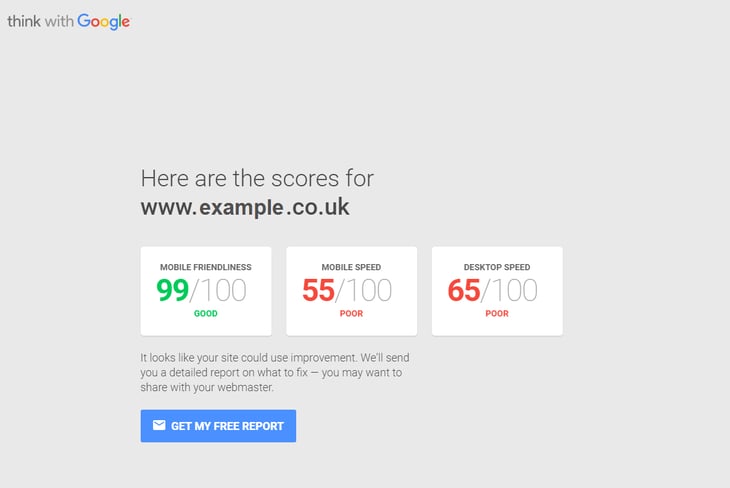
It lets you know how you fare in terms of desktop site speed, mobile site speed and mobile friendliness. It gives all this data in one place and breaks it down easily.
The brand new tool is available here - https://testmysite.thinkwithgoogle.com/
Continue reading this article to find out more about Google's new tool and how you can use it to help your business get more customers! Plus, we discuss some extra tips to help you improve the usability of your website.
Everything In One Place
One of the big benefits of the new tool is that everything is all in one place. You used to have to check page speed in one tool and mobile friendliness in another. However, this combines the two. They also email you a comprehensive report that breaks everything down for you. You can simply send this straight to your website hosts and ask them to resolve the issues it suggests. The tool also gives you a score for mobile friendliness instead of just saying yes your website is mobile friendly or no it isn't.
Did you know that people are 5 times more likely to leave your website if it isn't mobile friendly! Also, in today's world, if your website is slow and doesn't load right away it will cause potential customers to leave.
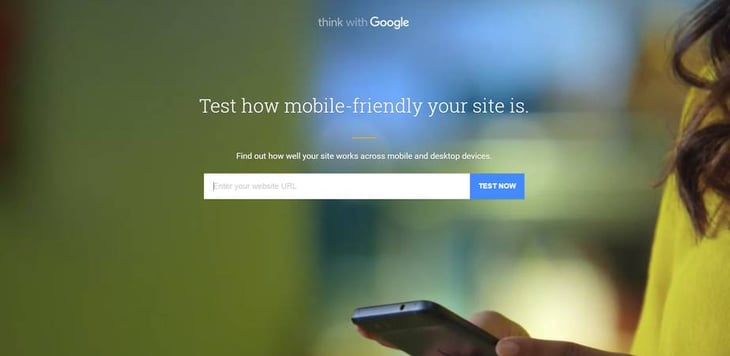
To get started, all you need to do is go to the URL mentioned earlier, enter your website address and hit “test now”. Here is an example screenshot...

As you scroll down the page there are also more detailed sections for each element. These give you recommendations and details of what to fix. You can then click “Get My Free Report” to be emailed more details. The report is sent within 24 hours and you can use it as a starting point to fix the issues with your website.
Some Extra Tips For Making Your Website More User-Friendly
This new tool from Google is great and can really help identify key problem areas with the usability of your website. However, it doesn't stop there. Here are some extra tips to help you improve the usability of your website.
Navigation
Your website navigation is a crucial part to website usability. Make sure it is clear, easy to use and utilises drop downs and sub drop downs where applicable. Double check that everything is working as it should when you click or hover over a tab. As well as that, always make sure there are no broken links. Finally, it is a good idea to have a sticky navigation menu that stays locked at the top of the screen when scrolling. This improves the user experience and makes it easier for them to navigate around your website. Our website does this: http://www.jdrgroup.co.uk
Internal Links
Moving on from navigation, internal links are very similar. They should be included throughout the copy on your website. Don't overdo it though! Try and link to one or two pages on your website on each page, if it is relevant. However, if there is no opportunity to link to another page for more information then don't.
Text Size and Font
Always make sure your text size and font is clear and legible. It shouldn't be hard to read! A general rule of thumb is to use a standard font size of around 12 for your page copy. With fonts, anything like Arial and Open Sans work well. Make sure you use a web recognisable font.
Clear Next Steps
Another good tip is to make sure the next steps you want your website visitors to take are clear. This can be done using different kinds of language; namely: Graphics, like arrows or calls to action, that say something like “click to enquire” or “click for more details. This helps to push your website visitors along their buyer journey and makes life easier for them when navigating your website.
Above The Fold
This is hugely important. Always make sure your main content is above the fold so that your website visitors know what the page is about straight away. This will help keep them on the page longer and improve their experience. It is also good practice to include a call to action above the fold.
Conclusion
If you are unsure how user-friendly your website is, or know you need to improve your user experience, then by using the new Google tool and some of the extra tips in this article your website visitors will definitely enjoy their time on your website more. You will also benefit from better bounce rates, longer time spent on your website and more enquiries.


