How Do Website Designs Vary Based On Industry & Do You Have To Follow The Trend?

Websites have a lot of variety, both in design and purpose. You could have a brochure site to raise brand awareness, you could have an ecommerce site to sell your product or you could have an online gallery to show off your content.
A major factor in deciding on the design of your website is the industry in which you work. The work you do will dramatically change what is needed on your website. If you produce chemical bonding agents, you will have no need for a gallery while if you're a designer you're going to need to show off your previous work.
Let's take a look at the difference in website designs for a few diverse industries...
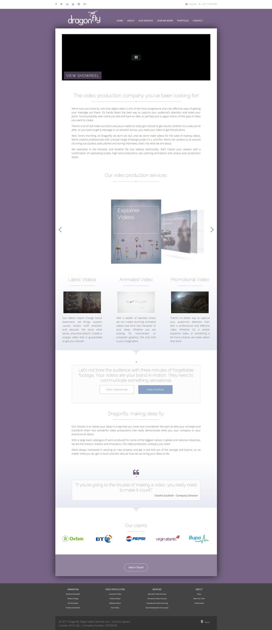
Video Industry
In the video industry, it's all about showing what you can do. Your website needs to include lots of footage and show-reels as this is what will procure you clients. Because of this, you will end up with a lot of large files which can affect your website speed if you don't account for it.
The most common method for countering this is to make the design itself rather simple. There aren't many animations on the website and the segments are small and simple. As a video is so visual, it is still important to keep the website aesthetically attractive though, despite its simplicity. Choosing a striking yet simple background will do wonders for making your website pleasing to the eye.
The first thing a video company wants to see is their previous work so a show-reel will usually be at the top of the page. Like all B2B business, a company will want to show off their larger clients to show that they can be trusted.
Engineering Industry
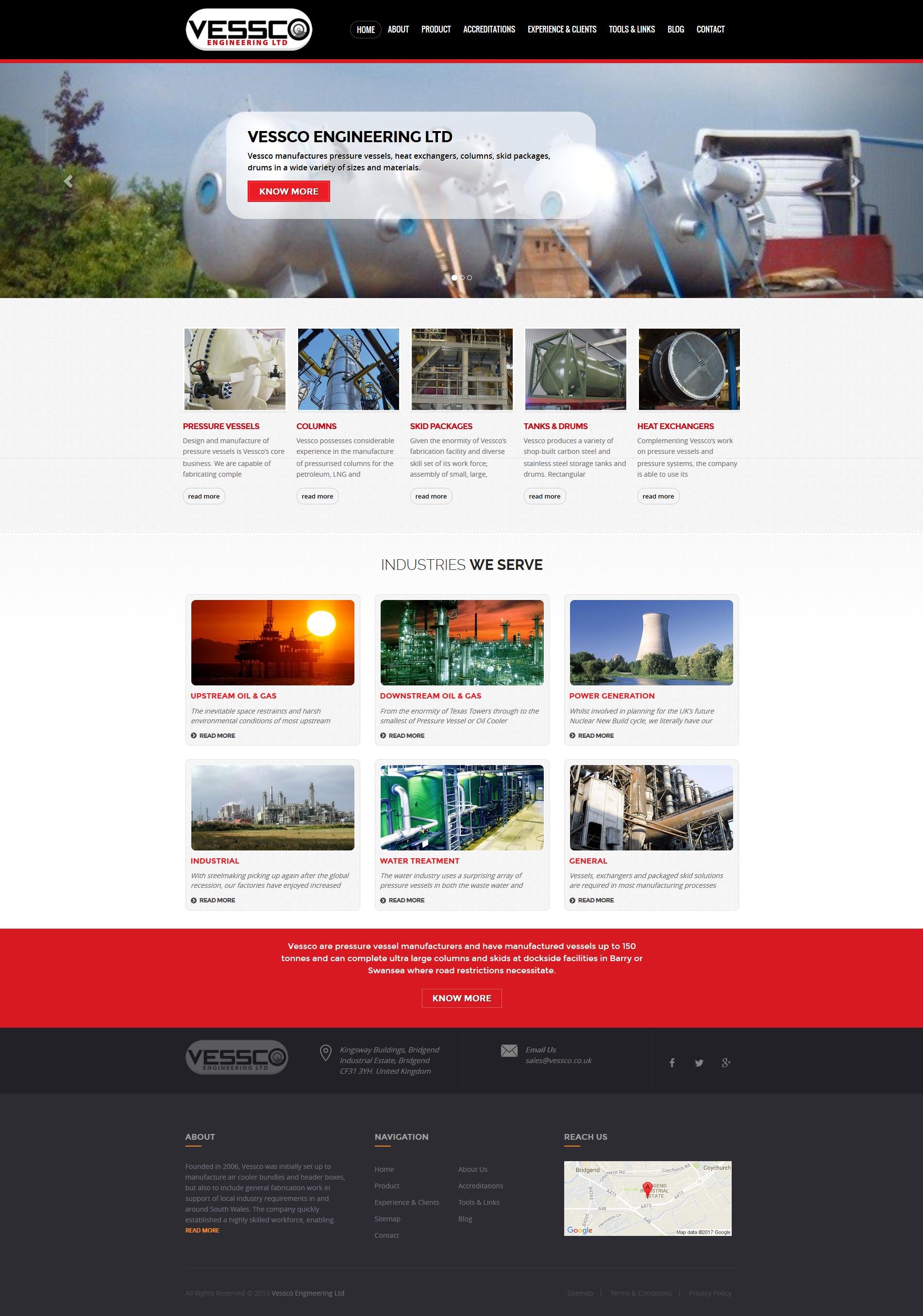
In the engineering industry, a website is used to explain what they do and which industries they can help in. They will also have a page for case studies as their work isn't visual but they still want to show what they're capable of.
The branding on engineering websites is very strict as competition is often more intense as there is less work to go around in these niche areas. There are often a lot of straight edges and strong angles in these designs as they have a more professional feel, as does the use of plenty of white.
Video Game Industry
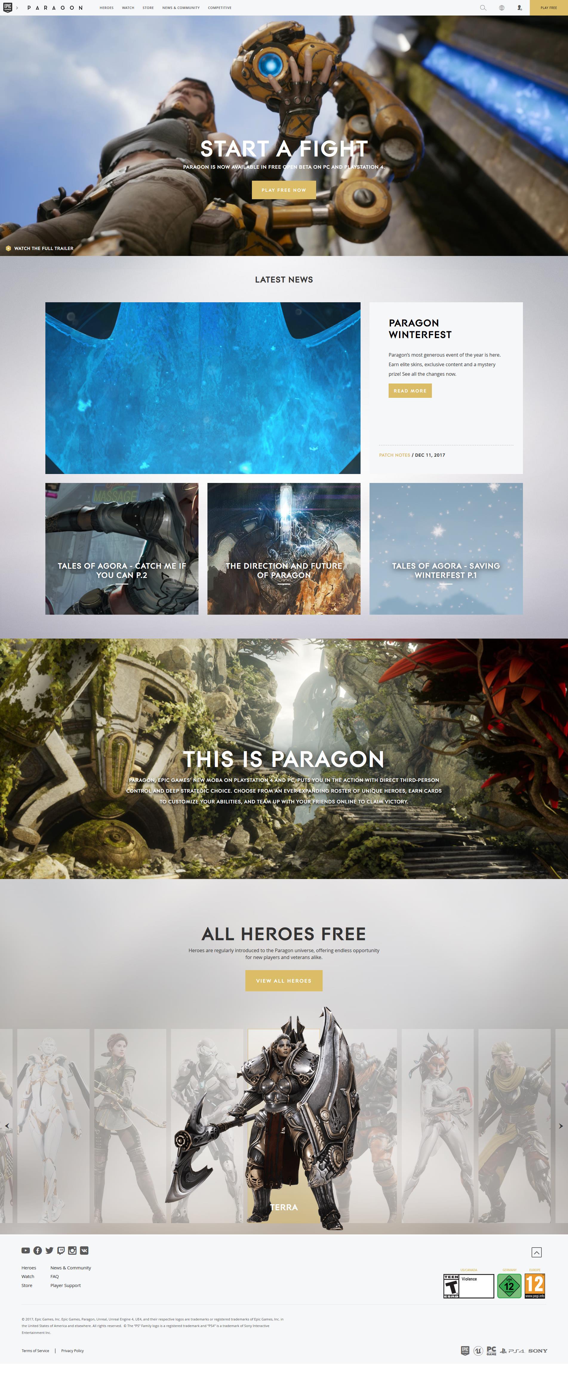
Websites in the video game industry follow an extremely visual theme. Every part of the website has something interesting and attractive to look at. As the product is purely digital and is often purchased on the website itself, everything on the website needs to encourage the visitor to engage. Seeing that video games are purely visual with little to no reading necessary, it is highly likely that the best leads will be engaged by imagery and video and will likely not read much while on the website.
There is usually no empty space on the website. Titles and text are placed on top of attractive imagery and every segment will have a CTA in it. Due to the visuals being manually created there are no resolution restrictions so images and videos are often full width, maximising every bit of space.
Due to the product being directly used by consumers, any changes (updates) to the product need to be explained to the customers making a blog a must-have on video game websites. The product also has an extremely long life cycle compared to most industries which means customers will often be returning to the weekly looking for new content and updates. Because of this, your website has a shorter life than many and needs to be updated almost constantly to maintain interest.
Architectural Industry
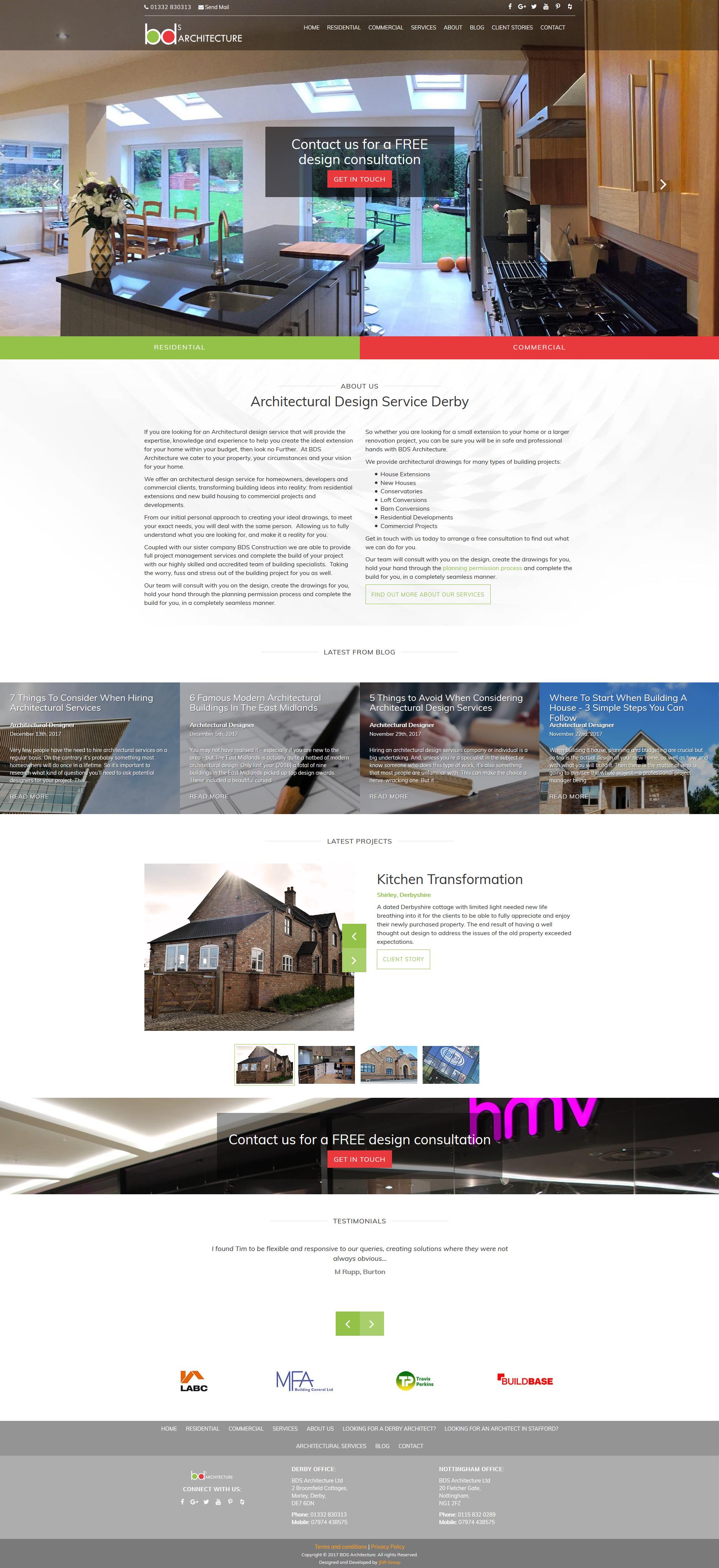
In the architectural industry, websites are designed around showing their designs, whether that be initial sketches, CAD designs or photos of finished designs. They will have many case studies that appear on the homepage in order to show off their work without having too many galleries.
They will use a lot of white space in order to achieve a professional feel. Branding is important on an architectural website but the colours will be used subtly throughout the site instead of being the main focus. If they have any large clients or partners they will usually include the logos at the bottom of the page. The site will use straight edges to maintain that professional appearance.
Home Improvement Industry
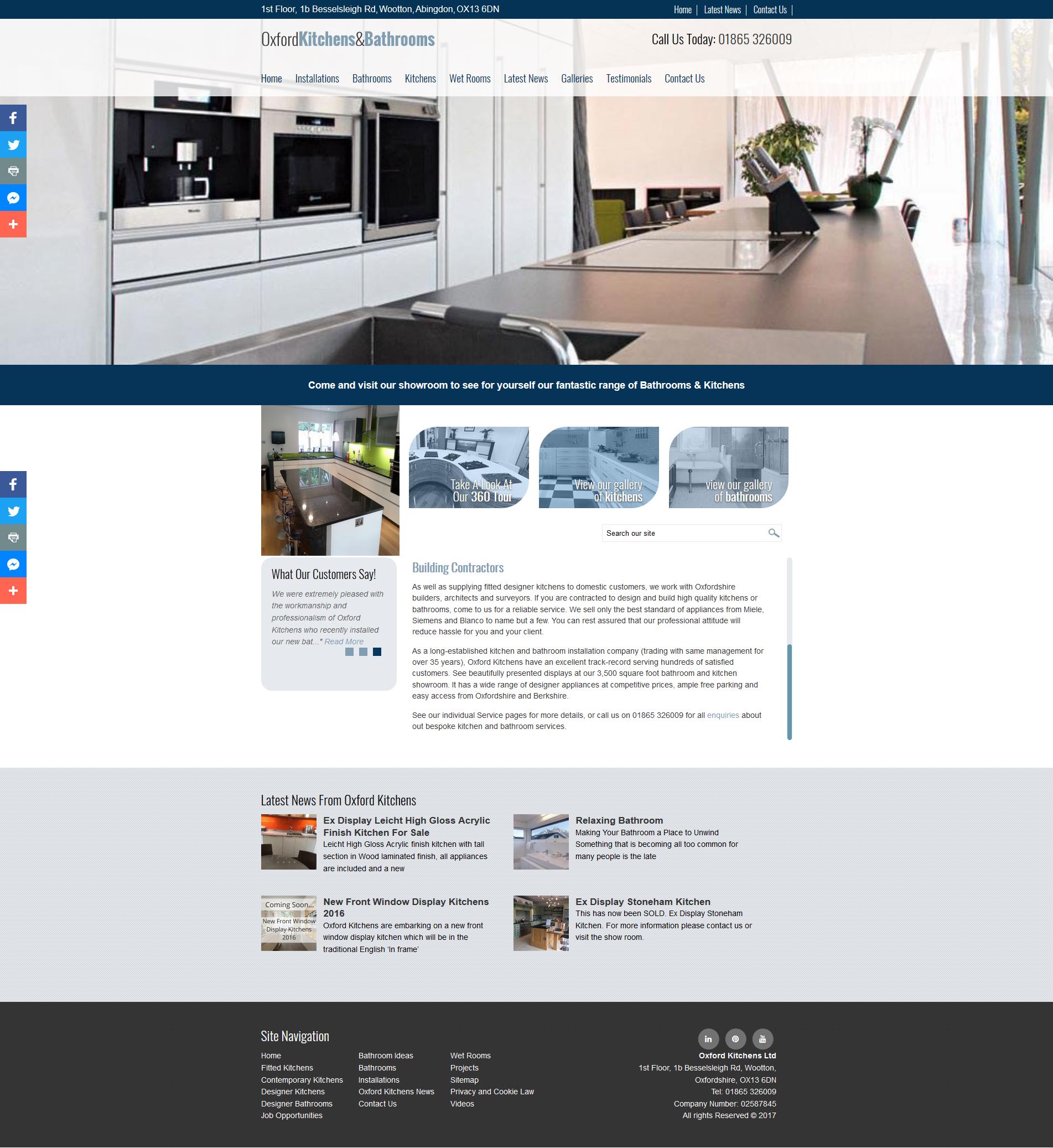
Home improvement websites maintain a professional feel by using plenty of white and having impressive visual banners. They have branding but the colours are used as an accent rather than main pallet. These websites usually want you to look at their work rather than browse the site so the text is usually limited and the pages are shorter than many sites.
Reviews are an important marketing tool for any businesses that sell directly to consumers so there will usually be an area for testimonies.
Should You Stick To The Trends?
After looking at the trends that different industries use it's clear that many of them share similarities. Most websites want to show off their work and will use large images to do so. But there are also clear differences. Entertainment businesses will be much more visual than B2B businesses. You don't have to stick to these trends though! If you have a particularly visual trade or service it may be a great idea to implement a highly visual design like that of a video game website. If your service is visually interesting using video could be beneficial. Trends become trends because they work but don't limit yourself to what everyone else is doing.
Tell me your thoughts on sticking to website design trends in the comments below! Does your website follow the current trends or are you trying something unique?
For more information on website design, or to have a unique, effective website designed for your business, contact the JDR Group today.

