5 Ideas For A Great Website Landing Page

Website landing pages are an important element of a B2B content marketing strategy. They form an integral, permanent part of your website and address a specific service or geographical market. They are often used in content marketing in conjunction with blog posts, but are different in style and form to both articles and core webpages.
What is A Landing Page?
For most businesses, a landing page is a small, self-contained webpage that sits apart from their core pages and main navigation. Your core pages include your Homepage, About and Service pages – those pages that contain all the information about who you are.
A landing page is far more specific, and is designed to capture traffic searching for a specific keyword. For instance, you could set up a landing page to focus on ‘Creative Agency Derby’. The idea would be to rank well on Google for this search term and capture as much of this keyword’s search traffic as possible.
Visitors would land on this page and be directed to either make an enquiry or seek further information on your main site. Landing pages are thus tied up with your SEO and your wider online profile.
A landing page is successful if it fulfils the following three goals:
- More Visits
- More Leads
- More Sales
These principles should be kept in mind whenever you create a new landing page or analyse the performance of existing pages.
How To Supercharge Your Landing Page For Maximum Impact
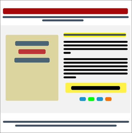
In terms of both structure and content, landing pages differ from core pages in several important ways. If you’re serious about using your landing page to its full effect, give some consideration to the following five tips:
1) Drop The Main Navigation
Your main website will have a prominent navigation feature to enable visitors to explore your webpages easily. As a landing page is a stand-alone ‘micro-site’, this isn’t necessary, and may even reduce the impact of the page by distracting your visitor. On a landing page you can get rid of the main navigation altogether, in favour of text-based links or navigation buttons.
2) Make The CTA Central
Landing pages are all about a very specific call to action. This should be the central aspect of your page, both visually and in terms of content. Have your core proposition right in the centre of the screen, clearly spelled-out in your main H1 title. Link this proposition to the keyword you are optimising. So, to continue the earlier example, your ‘Creative Agency Derby’ landing page should be about specific services you provide in Derby and how they relate to your visitor’s search query. Next to your CTA, give your visitor a nice and easy enquiry form to fill out so they can get in touch straightaway. Find out more details on what makes a great CTA with this article - Four Tips for Developing Effective Call to Action Buttons.
3) Emphasise Your Value Proposition
Again, be specific with this. Use your landing page to explain how your services add value to your customer, addressing their problems, saving them time, saving them money and reducing their stress. Spell it out clearly. A landing page is not the place to speak in general terms about your business or to promote your secondary services (or similar services in different areas for geo landing pages). If relevant, you can include text links to your main site where visitors can go for further information.
4) Keep Your Content Short & Sweet
All the content rules that apply to websites in general are even more important on landing pages. You need to provide a convincing case for your service and be informative, but you should do so in the most concise way possible. Videos and infographics work really well on landing pages as they are quick to digest.
Written content is important too, as this will affect your ranking on Google. You should include 300 to 350 words of content, but try not to go too far over this. Furthermore, you should break up your content into small text boxes and paragraphs with plenty of bullet points, stats and handy facts.
5) Maximise Social Shares
Make it shamelessly easy for visitors to share your landing page content on Social Media. Have your Facebook like and share buttons all set up, as well as Twitter and Pinterest – if you use it.
To help your visitors do this, pay attention to your page URL. A lengthy URL will discourage visitors from copying it into social media posts or SMS. Make the page URL directly relevant to the landing page keyword and host it on the top level of your site.
For example, use something like http://JDRwebsites.co.uk/landing-page.htm; rather than http://JDRwebsites.co.uk/services/promotions/2016/really-long-landing-page-URL-title%%%.htm
Reboot Your Website
Landing pages are an exciting approach to content as they allow you to continually refresh your website and expand your reach while leaving your core pages intact. For more advice about how you can use landing pages to get more visits, more leads and more sales, speak to one of our marketing advisors today.


