4 Things That Are Destroying Your Conversion Rate And How To Fix Them!

Conversions on your website are something that you define, as the business owner. A conversion could be a direct purchase, an enquiry form submission or a newsletter sign up. These are just a few examples. There are a number of different elements on your website that affect how your website converts.
Are you happy with the amount of leads or enquiries coming from your website? Are you even getting any at all? In this article, I am going to discuss 4 things that could be destroying your website conversion rate and how to fix them.
1) Website Speed

The speed of your website is crucial. The slower it is, the poorer the user experience is going to be. Having a quick website not only pleases your visitors, but it also pleases Google. Google loves to see quick websites and website load time is one of the many factors they take into consideration when ranking a web page. Do you think your website speed is up to scratch? If not, it could be causing a higher bounce rate and harming your conversion rate. Ultimately, this could be costing you!
There are numerous websites out there on the World Wide Web that you can use to check the speed of your website. A lot of these sites will give you a score and also give you some recommendations as to what can be done to improve it.
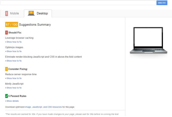
The first place I would start when checking your website load speed is with Google. They have their own tool “Page Speed Insights” in which you can check it. Once the website has been analysed you will get some suggestions that look like the screenshot below...

The best thing to do from here is to pass these onto your web developers to get them resolved as quickly as possible. Remember, once they have made the changes, run the speed test again to ensure your website is up to scratch.
2) Mobile Friendliness

As with the speed of your website, how friendly it is on a mobile device is again another crucial element you need to consider when looking at your website conversion rate. You could be ticking every box for desktop visitors but none at all for mobile visitors. If this is the case and a lot of your website traffic comes from mobile devices, then you are definitely harming your conversion potential.
The first thing to do here is to double check your website is mobile friendly or responsive. The easiest way to do this is to check it on a mobile device. If the website responds to fit your screen size and you don't have to zoom in, then it should be fine. However, for a clear answer on whether it is mobile friendly or not, just use Google's Mobile Friendly Tool here - https://www.google.co.uk/webmasters/tools/mobile-friendly/
It will simply tell you whether or not your website is mobile-optimised, and what you can do to fix it if not.
It is usually as simple as getting in touch with your website hosts and asking them to make the website mobile responsive. This may be quite pricey depending on the work involved but it is worth it in the long run. Also, it is yet another factor Google look at when ranking a web page, so again it's another box on their list you'll be ticking.
3) Calls To Action

There are a lot of business owners I have spoken to in the past that have no clue at all what a call to action is. Do you? A call to action is a button, graphic or a bit of text that stands out and prompts your visitors into doing something. A few examples of call to actions are:
- Request Your Free Quote Today
- Call Us Now
- Download Your Free Guide
- Shop Now
These are just a few examples. As mentioned above, they can be presented in a number of formats, provided they stand out. Adding the relevant call to actions across your site can really help with your conversion rate as it tells people to take action and lets them know the next step.
If you already have some call to actions on your site, then there are a couple of things you can check or change:
The Placement: It is always a good idea to have at least one call to action above the fold, especially on the home page.
Colour: If you are using a button for a call to action then try a different background colour - green often works well.
Text: You can also try changing the wording of you call to action. If you can include the word “my” instead of “your” then this can often work better, as the language is more inclusive.
4) USP's

As with calls to action, many business owners don't understand what a USP is. It stands for “Unique Selling Point” or “Unique Selling Proposition” and it really can have a huge impact on conversions, enquiries and sales! If you don't have a USP I would suggest you create one. It is basically a statement that sets you aside from your competitors, makes you stand out and shows why you are unique and better than your competition. In a way, it is saying to your prospects, “We're awesome and this is why you should choose us”.
A great example of a good USP is the Domino's classic “Fresh hot pizza delivered to your door in 30 minutes or less… or it’s free.” If you can craft something that gets your prospects thinking “wow, that is where my money needs to go” then you're onto a winner!
A great USP could include a time frame, a guarantee, highlight key benefits and should be something genuinely unique.
Conclusion
If your website is performing poorly at the moment, then start implementing some of the things I have talked about above. You should soon start seeing the improvements and then you'll reap the rewards!


